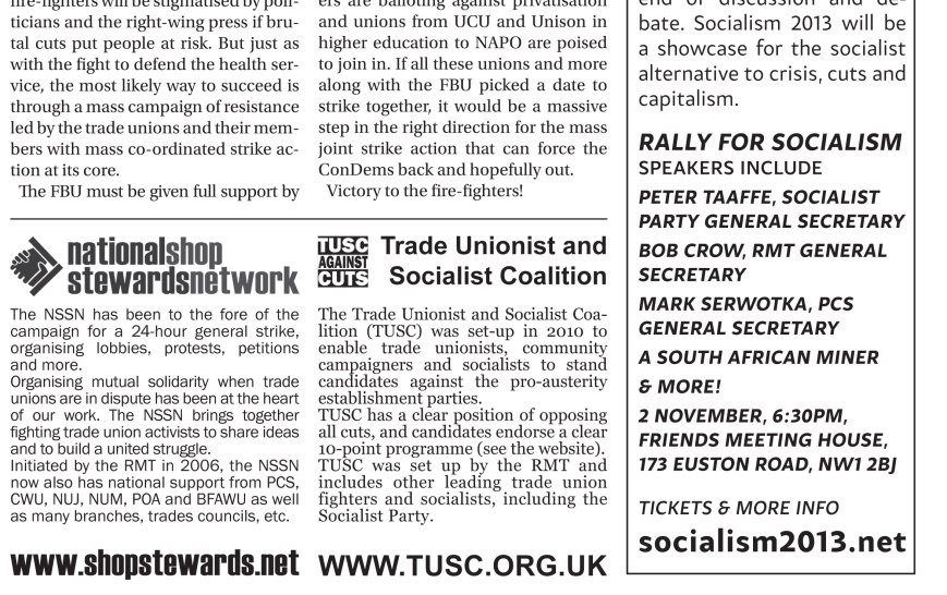
I don’t post everything that i lay out by a long shot. This blog is more of a ‘best-of’, and is primarily to look back at what worked and what didn’t, style sheets etc. Its in that spirit that I’m posting the above – an exert from the Socialist Party’s leaflet for the FBU strikes on Wednesday of this week.
I think that fonts can play a useful role in, even if subconcious, linking together material and giving boundaries within which you can develop different designs. There are three fonts for Socialism Today, 2 fonts for the national shop stewards network, 2 for tusc, 1 for Socialism 2013 etc.
Predominantly for material from the Socialist Party, I use utopia, which is the font that the socialist is in. You can see this on the top left and centre of the example above. On the right, the text is from an advert for Socialism 2013, which uses Samo Sans Pro, the sans serif font used in Socialism Today that the Socialism 2013 material also utilises. The two boxes for the Shop Stewards Network and TUSC are also designed in the respective fonts that are used on their material.
This is, clearly, partially naval-gazing, but I think that (after a few not-so-successful attempts to do the same), the 6 fonts above sit quite well with each other in this example.


